Globalbit
Back to Blog
UXDesignEnterprise

The UX Design Process for Enterprise Products (That Actually Ships)

·Sasha Feldman
The UX Design Process for Enterprise Products (That Actually Ships)

TL;DR: Enterprise UX design isn't about making things pretty — it's about making complex systems usable by real people under real conditions. The process has five stages: research, information architecture, wireframing, visual design, and validation. Most enterprise products fail at usability because they skip the first stage and rush the last one. A proper UX process adds 3-6 weeks and typically reduces post-launch support tickets by 40-60%.

Why enterprise products feel like punishment

You've used them. The internal tool that requires a 30-page training manual. The customer portal where finding your invoice takes seven clicks. The admin dashboard where every action triggers a confirmation dialog asking "Are you sure?"

Enterprise UX is bad not because companies hire bad designers. It's bad because the design process gets compressed or skipped. When a product manager says "the developers need designs by Friday," what they're really saying is "we're going to skip research, skip testing, and hope the designer's intuition is good enough."

Here's the process that produces software people don't hate using. It's the same process we followed when redesigning IBI Smart (now 600,000+ users) and building Espresso Club's customer portal.

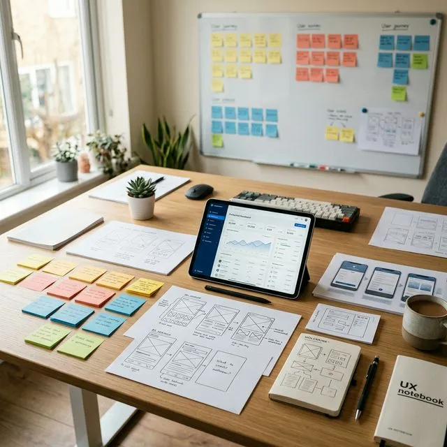
Stage 1: User research (1-2 weeks)

Design without research is decoration.

What research involves

User interviews. Talk to 5-8 people who will use the product. Not stakeholders — actual end users. Ask them to walk through their current workflow. Watch for workarounds and the "yeah, I just keep a spreadsheet for that" moments. Those spreadsheets are your feature requirements.

Task analysis. List every task users perform, how often, and the current steps. This reveals the 20% of features that handle 80% of daily work — those need to be immediately accessible, not buried three menus deep.

Competitive analysis. Not to copy competitors, but to understand conventions your users already know. If every competing product puts search in the top-left, putting yours in the bottom-right creates unnecessary friction.

What research produces

Design principles specific to your product. Not "easy to use" but concrete rules: "A power user should complete the top 5 tasks without touching the mouse" or "New users should file their first claim without training."

Background

Users abandoning your product?

Our UX team has redesigned enterprise products used by 600,000+ people. Let's look at where your users are dropping off.

Stage 2: Information architecture (1 week)

IA is how you organize features, navigation, and content so users find what they need without thinking about where it is.

Why IA matters more in enterprise

Consumer apps have 10-20 screens. Enterprise applications can have 50-200+. Without deliberate IA, navigation becomes a maze and users bookmark three screens and never discover the rest.

Common IA mistakes

Organizing by department instead of by task. Users think in workflows, not org charts. "I need to approve this purchase order" doesn't map to "Finance > Procurement > Approvals > Pending."

Too many top-level items. If main navigation has 12+ items, users stop reading after four. Group related functions. Use progressive disclosure.

Inconsistent naming. If one section says "Clients," another says "Customers," and the API says "Accounts," users lose trust.

Stage 3: Wireframing and prototyping (1-2 weeks)

Low-fidelity wireframes

Grayscale layouts showing content hierarchy, navigation, and interaction flows. Every screen, every user role, every key scenario. This catches cheap-to-fix problems: "Where does the user go after submitting this form?" or "This workflow requires three tabs — can we consolidate?"

Interactive prototypes

Clickable prototypes that look like the real product but contain no code. Users click through complete workflows, revealing usability issues static wireframes miss.

For IBI's trading platform, prototyping revealed users needed to execute trades directly from the portfolio view — a feature nobody requested because they'd never seen it as an option. That single insight reduced trade execution from 7 steps to 3.

Stage 4: Visual design (1-2 weeks)

Design system, not just screens

For enterprise products, you need a design system — a library of reusable components with defined behavior and styling. This ensures consistency across 50+ screens and enables faster iteration as the product grows.

Accessibility is not optional

WCAG 2.1 AA compliance is the minimum. That means 4.5:1 contrast ratios, keyboard navigation for all interactions, screen reader compatibility, and clear error messaging. Accessibility lawsuits have increased 300% since 2020. More importantly, accessible design is simply better design for everyone.

Stage 5: Usability testing (1 week)

Recruit 5-7 representative users. Give them specific tasks. Watch them attempt each task without helping. Record hesitations, wrong clicks, and immediate successes.

Five users catch ~85% of usability problems. You don't need 50 participants. You need 5 real users and the discipline to watch them struggle.

MetricWhat it tells you
Task completion rateCan users accomplish their goals?
Time on taskHow efficient is the design?
Error rateWhere do users make mistakes?
System Usability Scale (SUS)Overall perceived usability (68+ is above average)
First-click accuracyDoes the user's first instinct lead right?

Common mistakes in enterprise UX

Designing for the demo, not for daily use. The CEO sees a 20-minute demo. Users live in it 8 hours a day. Optimize for the 8-hour experience: keyboard shortcuts, saved preferences, minimal clicks for frequent tasks.

Treating mobile as an afterthought. Even for enterprise tools, 30-40% of users access from mobile. Retrofitting mobile layouts costs 2-3x as much as designing them from the start.

Skipping the handoff. Design is only as good as its implementation. Specifications, assets, component documentation, animation details — these determine whether developers build what was designed.

Frequently asked questions

How much does enterprise UX design cost?

For mid-complexity (20-40 unique screens): $30K-$80K for the full process. That's typically 15-25% of total development budget and the part most correlated with product success. See our cost guide for complete project pricing.

Can we skip research if we already know our users?

You think you know your users. You know what they tell you in meetings. Research reveals what they actually do — which is different. At minimum, observe 3-5 users performing real tasks. The "we know our users" assumption is the most expensive one in enterprise software.

How do we maintain design quality post-launch?

A design system maintained as a shared resource between design and development. When new features are built, they use existing components. When new patterns are needed, they're added with documentation. The system prevents the slow degradation where each developer interprets the design differently. Need UX help for your product? Let's talk.

[ CONTACT US ]

Trusted by 250+ organizations

Tell us what you’re building.

We respond within one business day

Discuss your Project →